Blog
Approving the Palette with a Pastel Soft Play Equipment Manufacturer

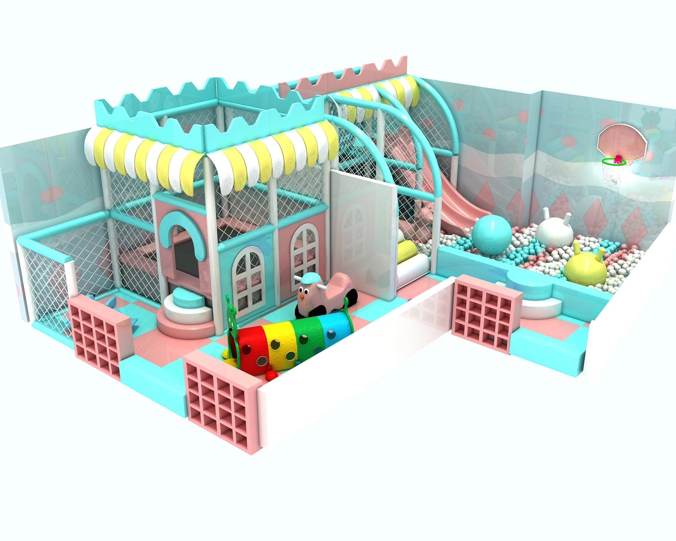
“Keep it pastel” sounds like a complete design instruction until the tower panels, slide, soft stair covers and ball-pool edge arrive in different interpretations of the same color. A buyer working with a pastel soft play equipment manufacturer should approve the palette by component and view it in the intended interior. Xinjiu’s Macaron and other indoor concepts provide real starting options for cafes, commercial play venues and distributors. Confirm the selected configuration, its visible surfaces and the relevant material information before using a concept image as a color specification.
A useful pastel brief identifies where the quiet colors belong, which activity edges must remain clear, and how the selected surfaces will be approved.
A pastel soft play equipment manufacturer needs a palette for the actual components
The Macaron Soft Play Playground shows pastel towers, a tube crawl and a ball pool. Its appearance comes from several visible parts working together, not from one color applied everywhere. A cafe operator coordinating an existing interior should identify the tower surfaces, the crawl connection, the pool edge and the slide elements separately. A request to match the room can then be discussed against the components the supplier will actually provide. The rendering is a visual reference; it does not publish finish codes.
Xinjiu describes theme, color and configuration customization. Use that service to define the intended combination, while leaving the actual available finishes and materials for confirmation. If the operator selects a different tower route, the palette may need another review because different surfaces become prominent. Moving from Macaron to Twin-Tower changes the importance of the connecting tube and soft stair approach. A palette approved for one front-facing illustration should not automatically be treated as approved for every arrangement.
The Soft Play Wonderscapes brochure presents theme palettes alongside play design. That professional context supports treating color as part of a coordinated concept. Its materials, dimensions and branded components belong to that company’s range. For Xinjiu, the relevant decision is the finish schedule for the selected Macaron, Castle, Clock, Twin-Tower or Carousel configuration, confirmed within the actual offer.
Macaron towers should retain a readable crawl and ball-pool boundary
A pastel room can be visually calm without making every component visually identical. In the Macaron concept, compare the tower face with the tube crawl and ball-pool boundary. Children and accompanying adults need to recognize where the activity begins and where another movement arrives. Ask for a view showing those relationships in the intended venue. A pale tower against a pale wall may look attractive in isolation while making the access opening less apparent in the room.
The Macaron tube crawl deserves its own color decision
The tube connects activities, so its visibility is part of how the route can be understood. If a cafe owner wants the tube to blend into the background, discuss the effect from the actual adult viewing position. If it is intended to be a recognizable crossing, give it a deliberate relationship with the tower colors instead. Neither choice establishes a technical advantage by itself. The final arrangement must still have the appropriate access, operating instructions and equipment-specific information.
Consider an operator whose interior uses a warm wall finish and subdued furniture. Selecting the Macaron concept does not require every soft-play surface to match those finishes exactly. The ball-pool edge may need to read as an activity boundary, while the tower facade can support the room’s broader appearance. Compare the supplier’s proposed palette against the actual surrounding finishes. Keep the objective concrete: identify the play entrance and the crawl route clearly, then coordinate the visual mood.
The ball-pool contents also affect the overall appearance, but the picture does not establish the supplied ball specification, quantity or complete color mix. Confirm what belongs in the order. If the operator changes the pool colors independently, the tower-and-pool relationship may look different from the approved image. That is a scope question as well as a design preference. The supplier’s written offer should make it clear which illustrated color choices are included and which remain selections to be confirmed.
Castle pastel facades and paired slides should not disappear into one finish
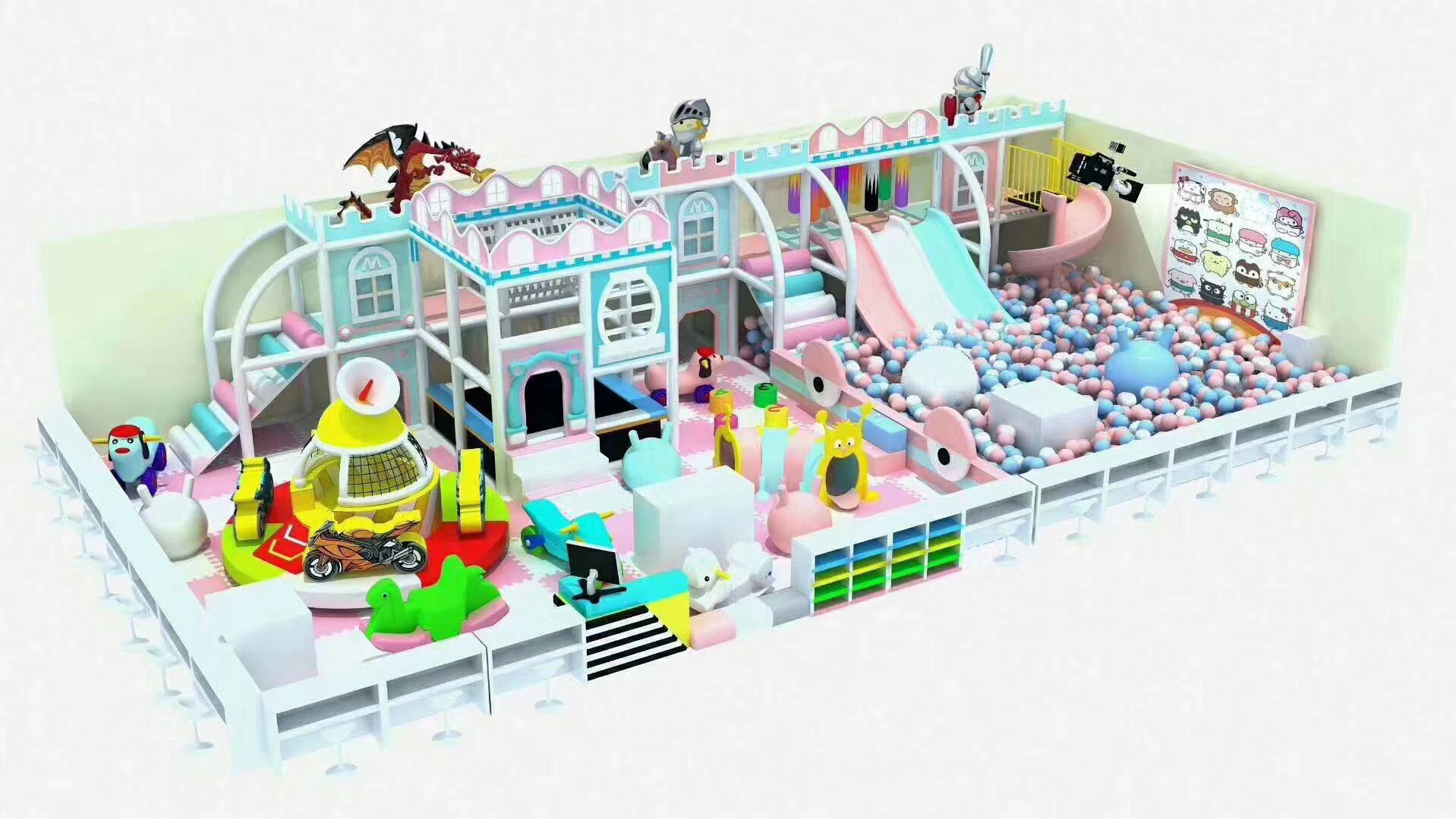
The Castle Theme Soft Play Playground combines a pastel facade, double slide, enclosed climbing routes and a ball pool. Its facade is a strong visual reference, but the paired slides define a functional destination. Review their appearance against the pool boundary and nearby surfaces. If all three are made visually similar, the operator may find the route harder to explain at a glance. A coordinated palette can still use differences that distinguish the climb, descent and floor-level activity.
Castle slide exits need visual review from the operator’s position
A distributor presenting the Castle option should request the view that matters to the intended operator, not only the most attractive facade image. A slide edge visible from the entrance may be less obvious from seating along the side. This is a reason to compare the revised visual angles, not to promise a universal contrast requirement from the concept. The product’s actual technical review remains separate. Color can help communicate the route, but it cannot replace suitable geometry or operating supervision.
For a venue using strong interior lighting, the same proposed pale finish may appear different on a curved slide and a flat facade panel. Ask which surface samples or finish references can be supplied for the actual components. A screen image can guide the initial discussion, but it should not be the only approval record for an appearance-sensitive order. Do not assign a material grade or coating method to the slide because it has a smooth-looking finish in the rendering.
If the buyer requests a more restrained Castle facade, keep the enclosure and climbing-route information intact during the design review. Removing or changing a themed surface may affect what can be seen from the operator’s position. Have the supplier identify whether the proposal changes only appearance or also the arrangement. Xinjiu’s customization capabilities can be used to coordinate that discussion, while final details need to be agreed for the ordered equipment.
Clock Theme soft play introduces details that a pastel palette must preserve
The Clock Theme Soft Play Playground includes clock towers, a double slide, climbing obstacles and a ball pool. The clock faces and tower edges create a different visual vocabulary from the Castle facade. Compare whether those details remain legible when the buyer requests softer colors. A Clock concept with unclear clock-front details loses part of the reason to choose it. The supplier’s revised illustration should show the actual proposed relationship between the theme elements and the main play surfaces.
Clock climbing obstacles should look like activities, not spare decoration
The obstacles belong to the play journey, so their finish should be considered alongside the approach and slide return. If the operator asks for every obstacle to match the nearby enclosure, review whether that makes the next activity harder to identify. Conversely, making every component a different accent can undermine the restrained visual goal. Discuss the role of the specific Clock obstacles and use a limited, purposeful palette for them. Do not choose colors by simply repeating the order used in another concept image.
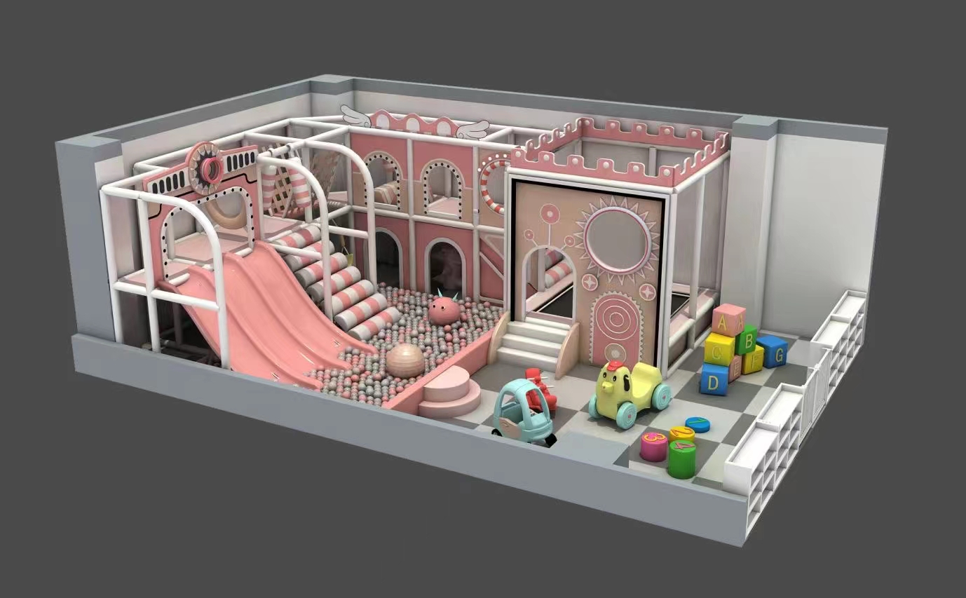
A distributor coordinating two venues should resist describing one approved Clock palette as a universal pastel specification. The second venue may have different walls, floor finishes and viewing positions. Reuse the agreed component references as a starting point, then confirm the relevant appearance for that location. This protects the difference between a repeat finish request and a new configuration request. No replacement stock or guaranteed matching batch is established by the website’s concept pictures.
Pastel soft-play procurement should separate appearance from material performance
A soft stair cover, a tower panel and a slide can display a similar pale color while needing different material information. The Twin-Tower configuration is a useful example because its tube, stairs and ball-pool slide appear in one connected route. Request the material and care information for the actual supplied pieces. Do not use the term “pastel” as a substitute for durability, cleaning compatibility or the documentation required for the destination venue.
The Compact Carousel Soft Play makes the same distinction important for a different arrangement. Its central attraction, twin slides and loose soft activity pieces are not one uniform surface. Ask how the intended finishes relate to the specified components and their care instructions. A finish approved on a fixed central piece should not be assumed suitable for a handled soft activity piece. The website does not publish a complete material schedule or a universal cleaning chemical recommendation for these concepts.
- Macaron towers and crawl
- Identify the agreed visual relationship and the supplier’s component references.
- Castle facade and double slide
- Keep the selected finishes tied to their different surfaces and functions.
- Carousel soft activity pieces
- Confirm the actual supplied pieces and their material-specific care information.
Read Xinjiu’s materials and production discussion for the company’s stated approach, then request the details applicable to the chosen system. The color approval should neither add an unsupported certification nor silently change the material scope. If the supplier proposes a finish change for a particular component, review the appearance and the relevant documentation together. A visually similar substitute is still a change that deserves explanation.
A later Castle replacement needs more than the word “pink”
A distributor arranging a future replacement for a Castle facade or soft cover needs to identify the original part and its agreed finish. Keep the component reference, location and approved finish information together. A venue photograph is useful context, but it may show a surface after use and under different light. Confirm how the supplier will assess a replacement request; do not assume an exact match or immediate availability. The current site does not publish those commitments.
For an order mixing Macaron colors with Clock details, component identification also matters during dispatch. Request a packing list that distinguishes the relevant tower faces, slide parts and soft pieces in the agreed configuration. Confirm the protection needed for the selected finishes rather than asserting a standard crate or wrapping method. At receipt, compare those parts with the approved references before the whole arrangement is assembled. It is easier to clarify a mismatched Clock detail while it remains identifiable than after it has become part of the tower facade.
The existing soft-play supply overview covers the broader order discussion. For this palette decision, place the Macaron or Castle finish references beside the venue’s actual wall and floor samples under the intended lighting. Then look again at the crawl opening, slide destination and activity edges. Approve a pastel arrangement that belongs in the room and remains understandable as play equipment, with each important finish tied to a specific supplied component.